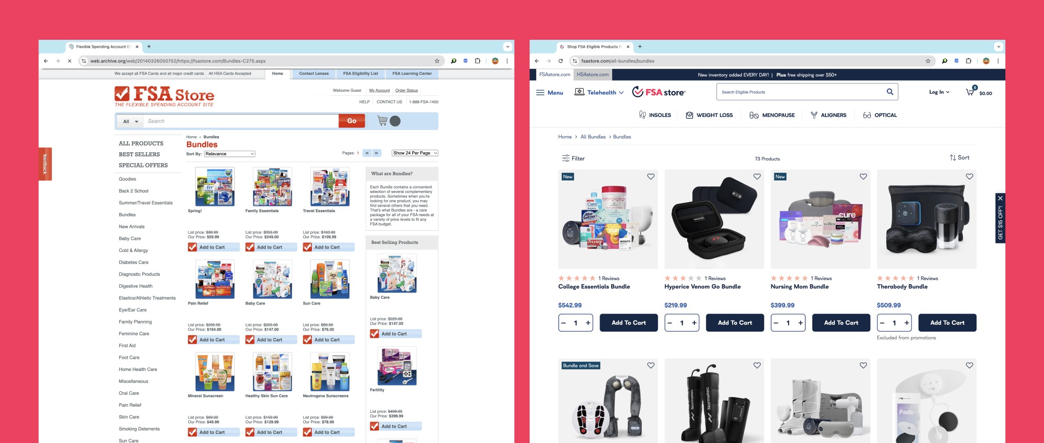
Health-e commerce came to Smakk Studios looking for a way to revamp their FSA and HSA marketplaces. At that point in time these sites felt dated. Born in the earlier days of the internet, these online stores lacked key modifications that most e-commerce sites take advantage of today. Things such as information hierarchy, page structuring, navigational updates, etc.. These oversights left users struggling to find what they needed and leaving shopping carts abandoned.
The process started with an onboarding call with Health-e Commerce’s team to develop an understanding of the brand, their goals, and desired website features. Shortly after, our team moved into an extensive research phase where I analyzed their current site looking for areas of modification and performed a competitive analysis to gain insights on improvement. I constructed low-fidelity wireframes of key pages (i.e homepage, category page, product page, learning center) to test improvements and gain user feedback.
After wireframes were approved. I worked with the project lead to apply new branding styles to the pages, working through areas like type hierarchy, color usage, photography and thumbnail selections, and icon implementation. Designs were handed off to the Health-e Commerce development team.
After, both sites were Q+A’d using Bugherd and launched.
With this project it was important to optimize the established webpage. Through the analysis of their old site we were able to identify and problem solve certain parts of the site that made the e-commerce shopping more pleasant and easy to understand. Some of these changes included:
Developed new navigational structures throughout the page to move customers to more promoted content and drive sales
Added tab structure for user to quickly jump between both sites
Added organization structure to pages that improved user focus and made checkout process easier to navigate
Implemented new brand stylings across 2 websites with over 15 key pages
Created Learning center page that helped educate new customers
Optimized designs for mobile to make for responsive web design
With these improvements, overall site usage became an easier process for their audience base and became a more attractive option for younger audiences to use.
Below is a series of work from previous clients.
To view project hover over the card and click.


