Health-e Commerce
UI/UX
UI/UX
UI/UX
E-commerce
E-commerce
The Challenge
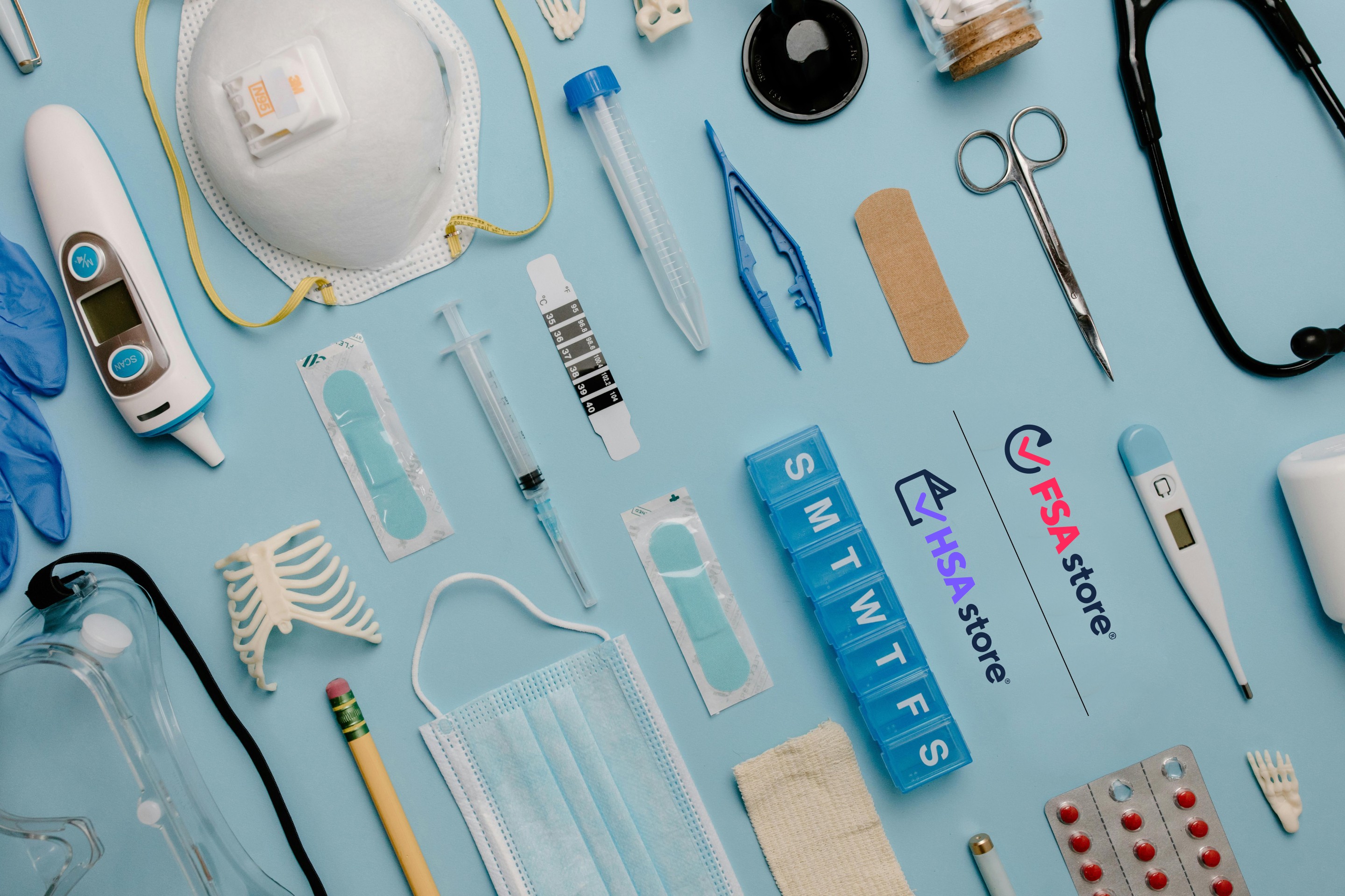
Healthe-e Commerce, the parent company to HSA/FSA Store - the leading online marketplace for HSA and FSA Accounts, came to Smakk Studios looking for a total brand over haul.
After completing a full rebrand of their logo, Type, Iconography and overall visual design system. We were tasked with carrying these improvements over to their outdated website. The project consisted of re-skining , restructuring, and improving general site functionality.
Key Objectives
Implement new branding across site
Make improvements to sites visual hierarchy, information architecture, and imagery
Improve accessibility standards - WCAG 2.0
Create Blog pages to improve SEO
Meeting the Audiences Needs
After talks with the Health-e Commerce development team and testing their site on our end. We conducted a user survey to see if our problem areas matched the users frustrations. The survey consisted of various questions to gain a better understanding of how the user interacted with the site.
From this we discovered that we were dealing with an vast audience. Most customers fell within the 26-60 year old range, all generally working professionals. Brand awareness at this time was low, as it seemed that many people did not know the benefits of owning a HSA or FSA account.
From all this it was clear that the site had a few areas that needed to be addressed:
Navigation and search filtering
Checkout experience
Blog + learning center creation
Incorporate newer UX principles/best practices
Optimizing the Navigation
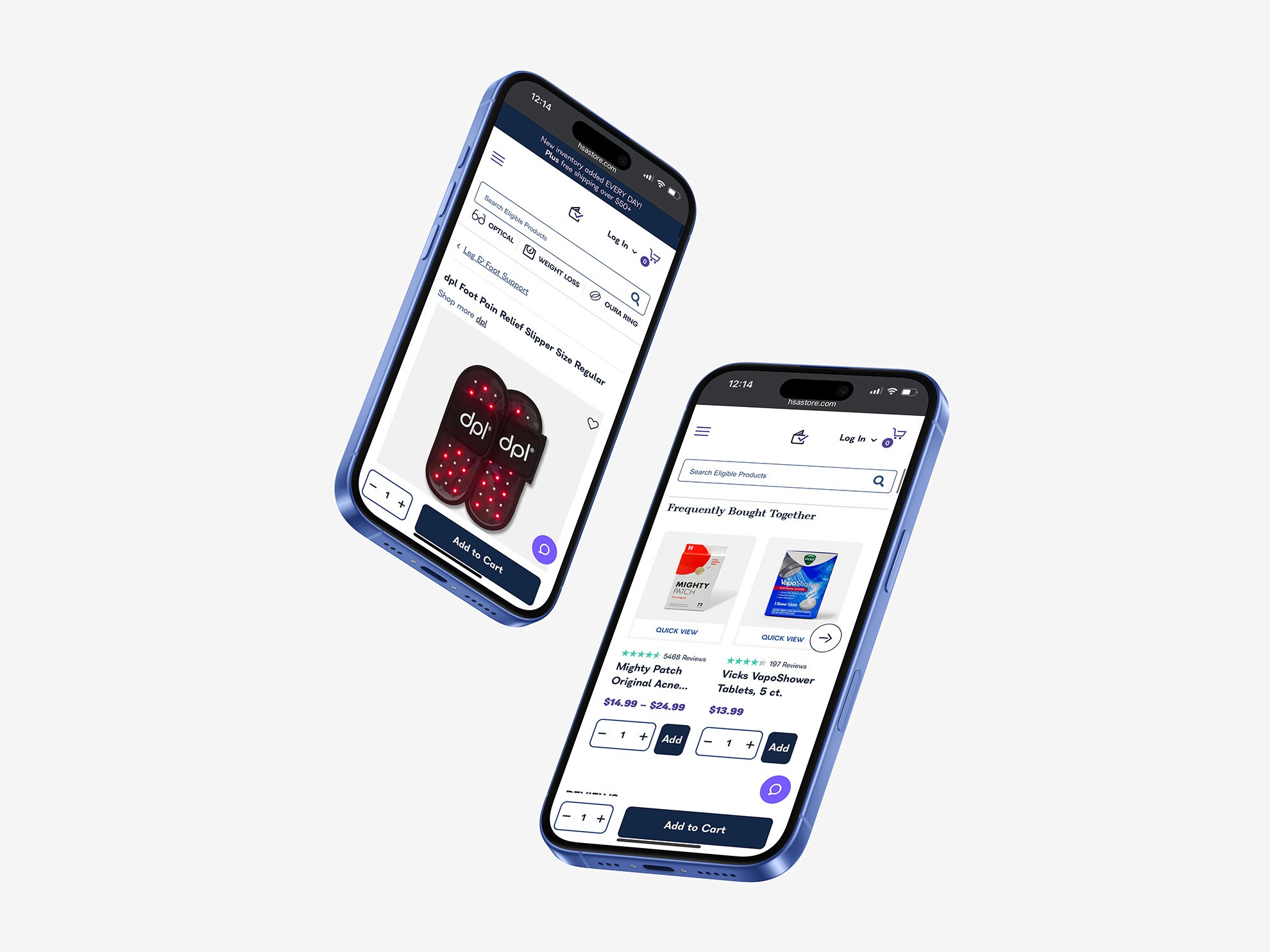
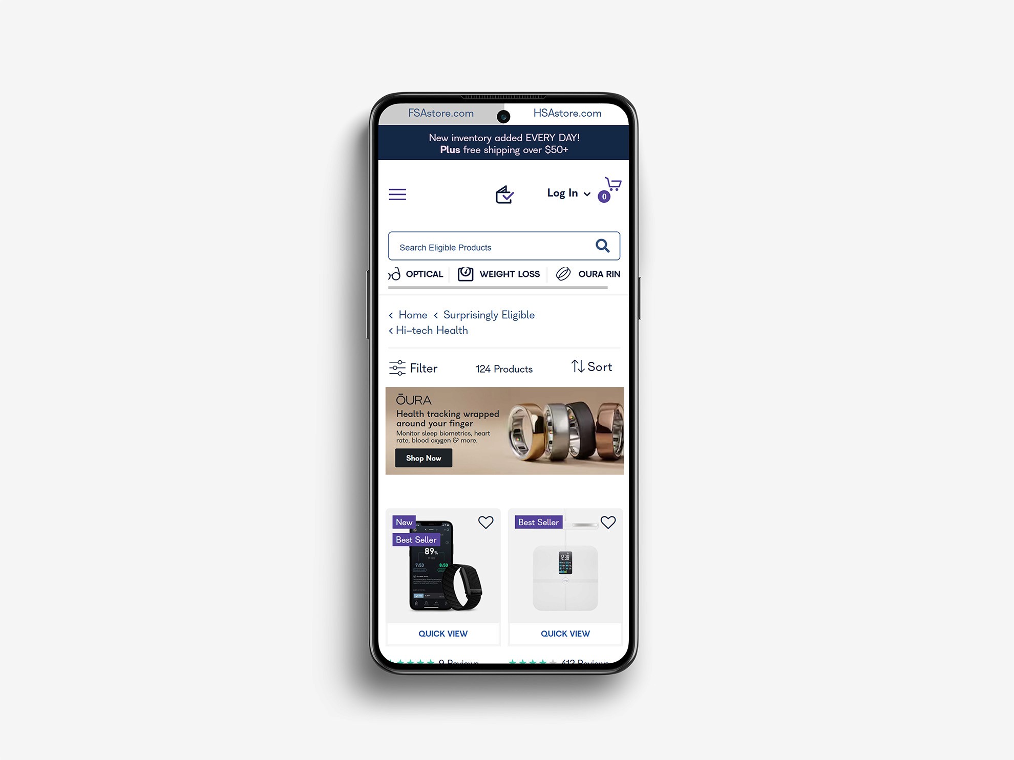
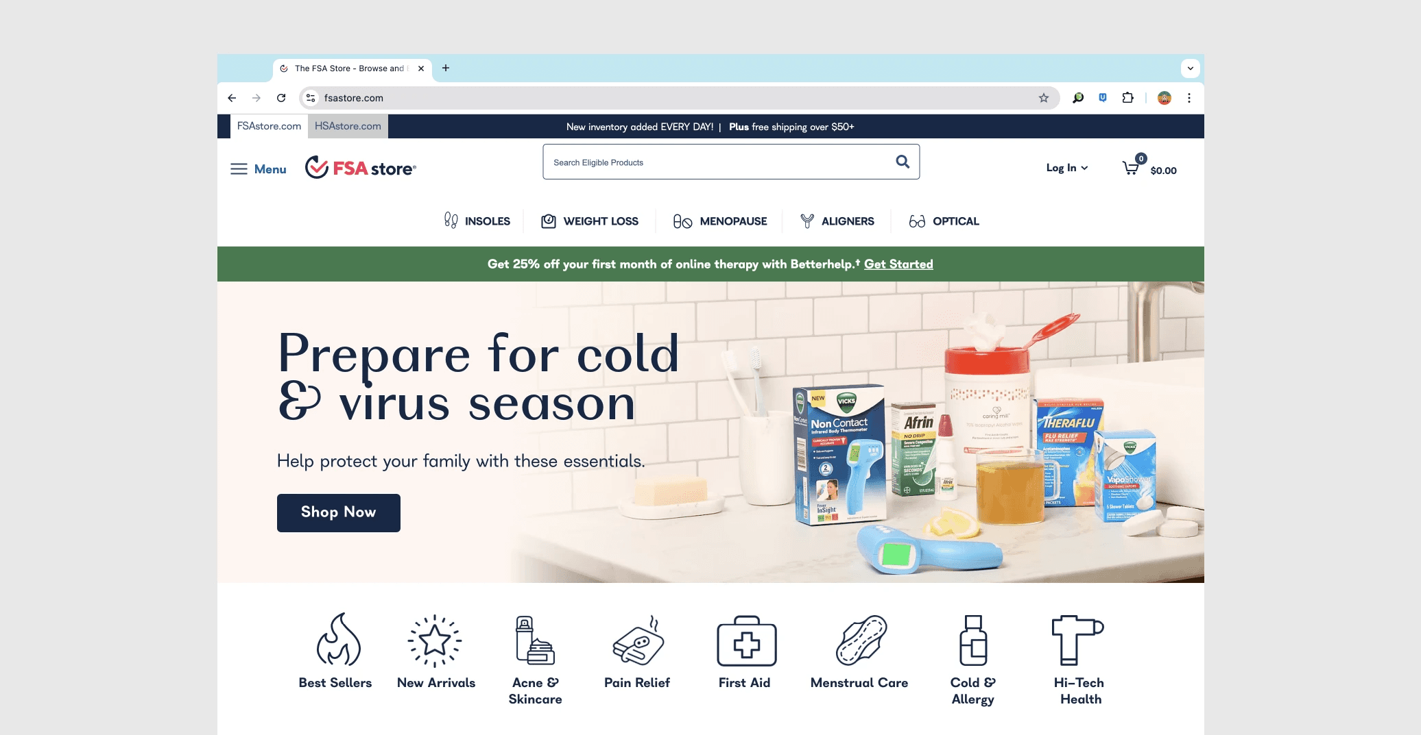
One of the major areas of the site that needed attention was the sites main navigation. The old version felt barren, putting the expectation that the user knows exactly what they need with no assistance on how to get there other than the search bar. By adding a sub-navigation below the search that links to a range of categories. we provide the user multiple paths to find what it is that they need. Where as before the user had to search for the exact product they want , they know are able to find a variety of products that will help them solve their needs.
During the wireframe process it became clear that we needed to find a way for users to easily transition between the suite of Health-e commerce's sites (FSA Store/HSA Store Optical). As some accounts only work on their corresponding accounts, we wanted to give the user the ability to make a quick switch without having to type in a new address. Making the transition smooth and easy helps keep the user in the same buyer mindset and deters them from abandoning their search altogether.
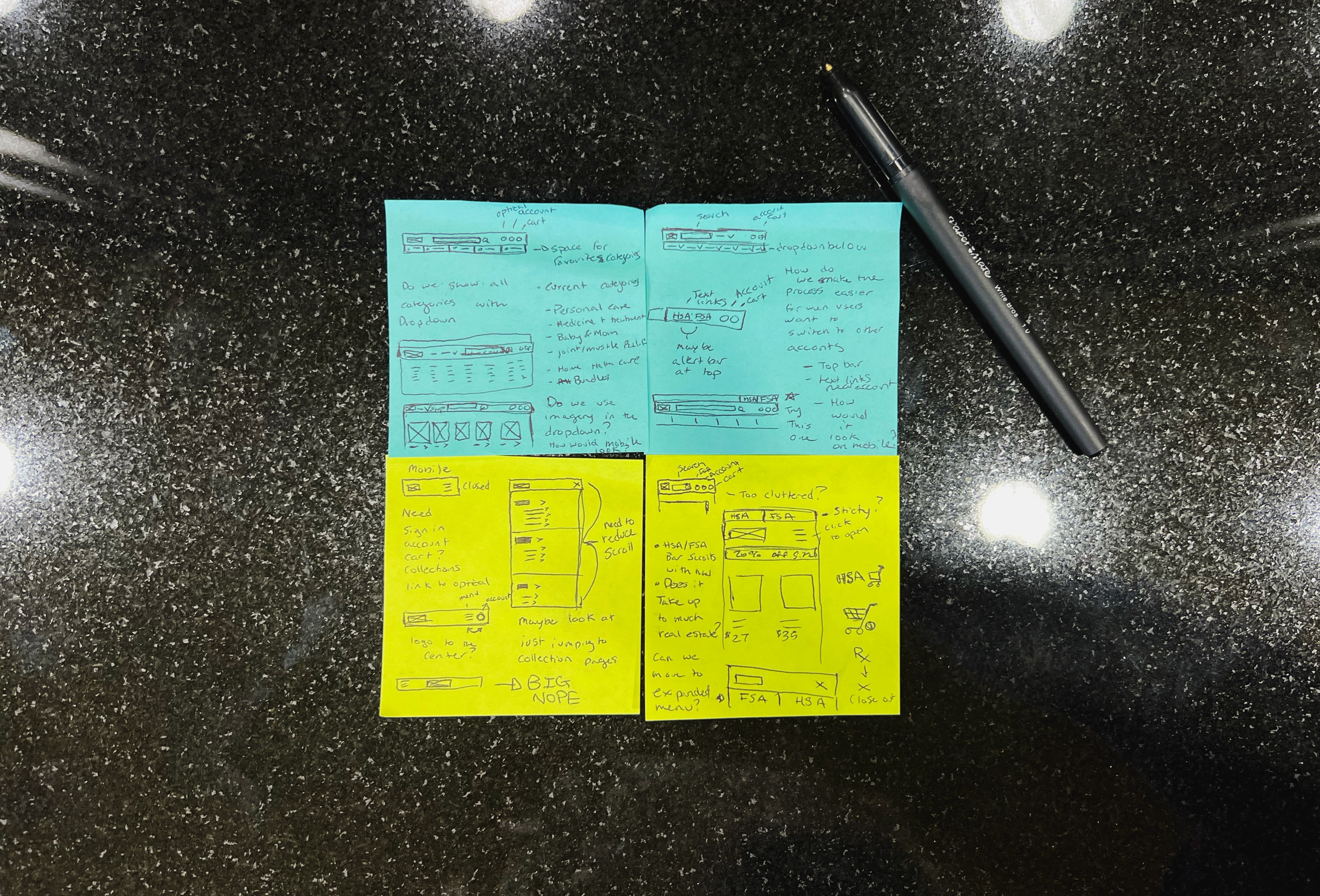
Sketches showing exploration of Navigation updates and thought process
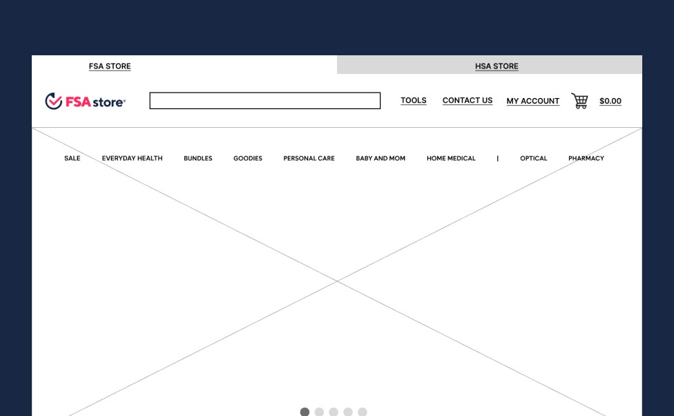
Wireframe for eary nav iteration
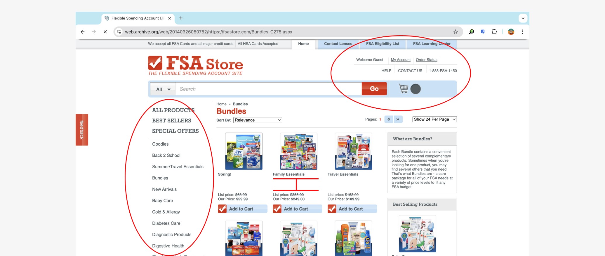
Showing the before and after - dividing the nav into clearer sub-sections made it easier for users to find what they need
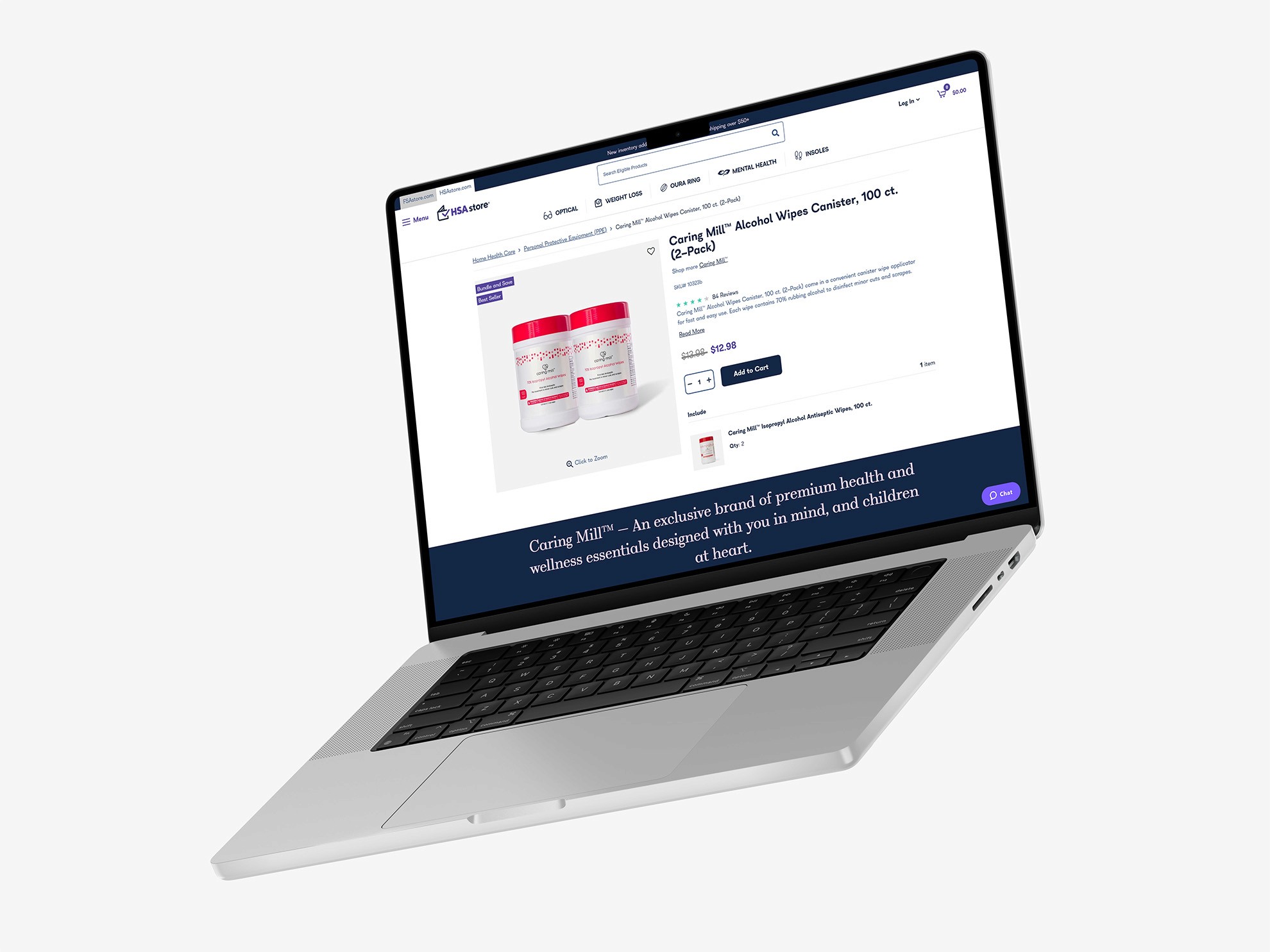
On collection and search pages of the earlier site, we found pages to be cluttered and littered with information. Product cards were small, Images were tiny and hard to make out, an. It was our goal to make these pages easier to scan and find what the user needed. We placed more emphasis on the product cards, increasing photo size and product name. We enabled the filter bar to be collapsed when needed, creating more space for product cards in a row, overall reducing the amount of scrolling on the page.
On collection and search pages of the earlier site, we found pages to be cluttered and littered with information. Product cards were small, Images were tiny and hard to make out, an. It was our goal to make these pages easier to scan and find what the user needed. We placed more emphasis on the product cards, increasing photo size and product name. We enabled the filter bar to be collapsed when needed, creating more space for product cards in a row, overall reducing the amount of scrolling on the page.
On collection and search pages of the earlier site, we found pages to be cluttered and littered with information. Product cards were small, Images were tiny and hard to make out, an. It was our goal to make these pages easier to scan and find what the user needed. We placed more emphasis on the product cards, increasing photo size and product name. We enabled the filter bar to be collapsed when needed, creating more space for product cards in a row, overall reducing the amount of scrolling on the page.
On collection and search pages of the earlier site, we found pages to be cluttered and littered with information. Product cards were small, Images were tiny and hard to make out, an. It was our goal to make these pages easier to scan and find what the user needed. We placed more emphasis on the product cards, increasing photo size and product name. We enabled the filter bar to be collapsed when needed, creating more space for product cards in a row, overall reducing the amount of scrolling on the page.
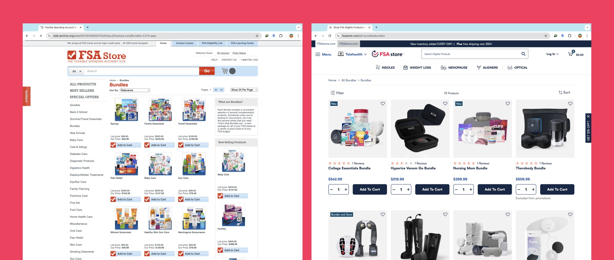
Comparison of bundle pages before/after - Right side prioritizes product imagery and amount of products shown
Improving Brand Awareness
Knowing thar their audience may not know the full benefits of their accounts, it was important for Health-e Commerce to educate them. When a customer has a the ability to learn form the company, it leads to increased brand trust.
Creating a simple blog/learning center pages allowed the Health-e Commerce to promote and educate their customers on their product offerings while generating more links to their site, generating a higher SEO value and increasing brand awareness.
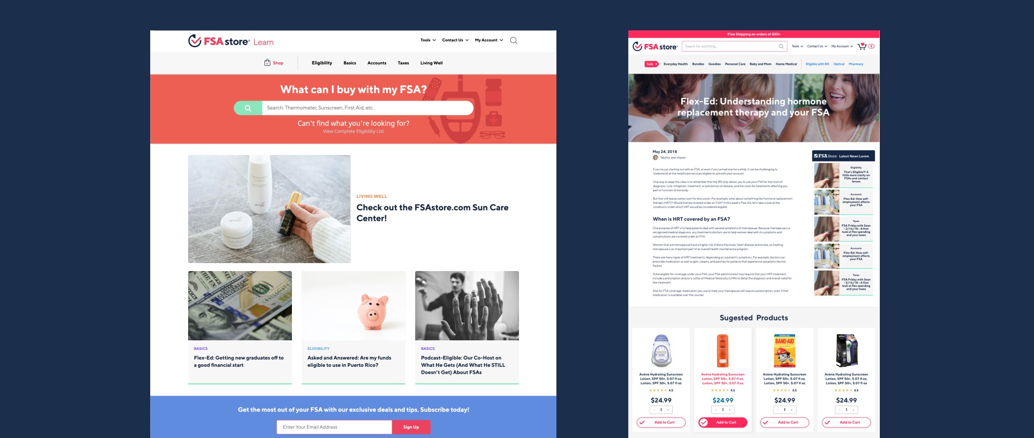
Blog pages - helped educate users while increasing SEO and gave Health-e Commerce the opportunity to market products
Solution & Results
Implemented UX best practices to optimize site functionality and improve usability
Used tabbed navigation to seamlessly connect shoppers experience between HSA & FSA Store.com
Applied new branding to over 100 unique pages across FSA/HSA/Optical pages
Improved layout for checkout experience
Created blog pages to increase site visibility and improve SEO
We saw an increase in completed checkouts
Site visits and page visits increased after launch
View more of the site below or view site here
Created interactive modules that utilized tabbed navigation that condensed information
Implemented a contact button that invited audience to talk and potentially use BCG for future projects
Embedded new and existing video to highlight key points
Used scroll animation to create interest and hold audiences attention
We saw an increase in page clicks and interactions when compared to previous articles
Time spent on page increased compared to previous
View more of the site below or view site here